ConocoPhillips
Qualitative Research • Data Analysis • Design Strategy Creative Briefing • Creative Direction • Presented to Client Leadership • Relationship Management
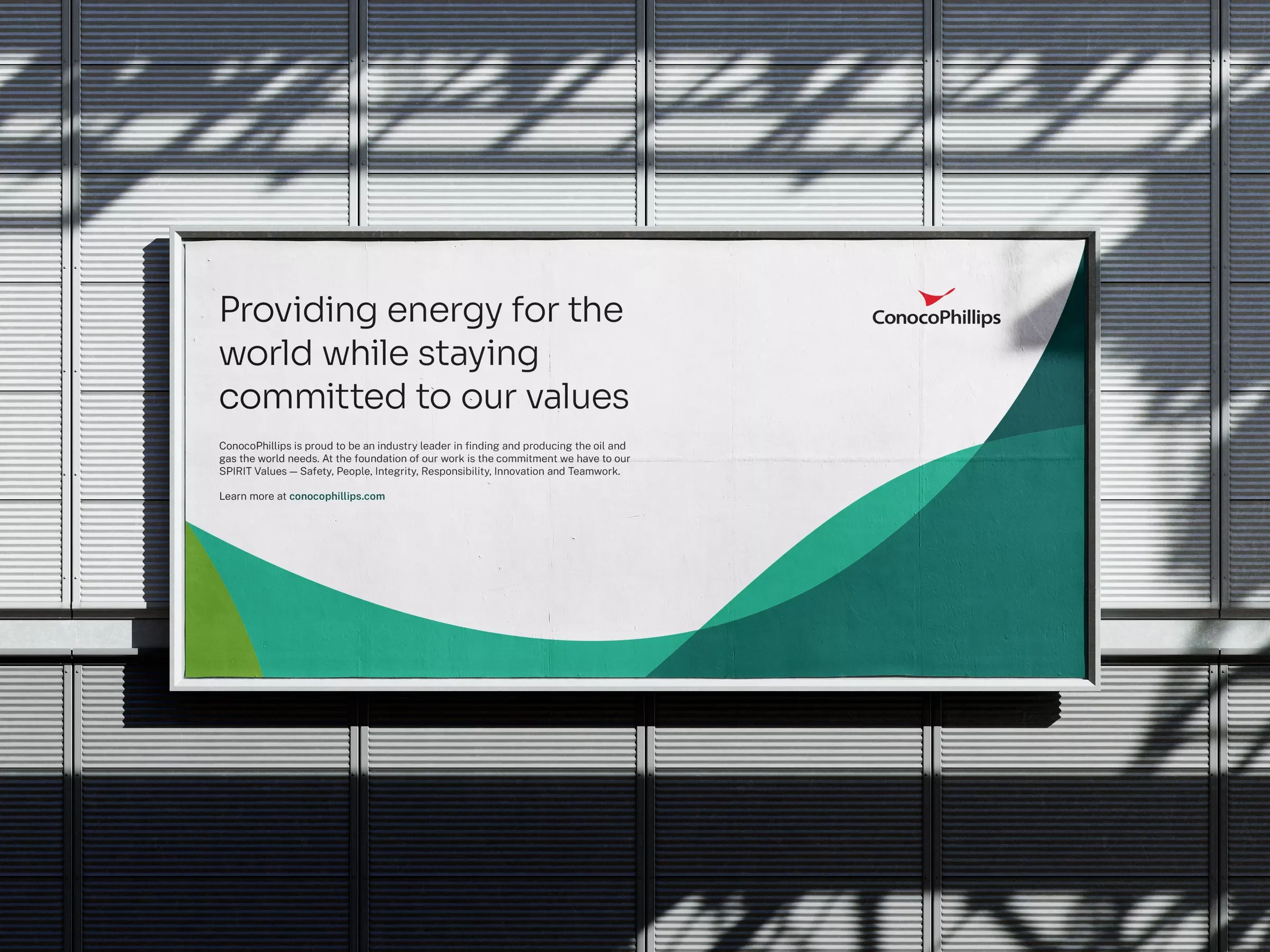
Challenge
The internal creative team at ConocoPhillips had weathered many acquisitions, but felt undervalued and ill-equipped to provide the company with the communications it needed. They asked us to create a visual identity toolkit that would unify, modernize and expand the visual identity of this iconic brand.
Approach
Research first showed employees were confused by the iterations and one-off designs they team relied on. We also discovered that despite public disapproval of its production of oil and gas, the company was well run, proud of its employees, a friendly work environment, and active in the communities in which it worked.
Solution
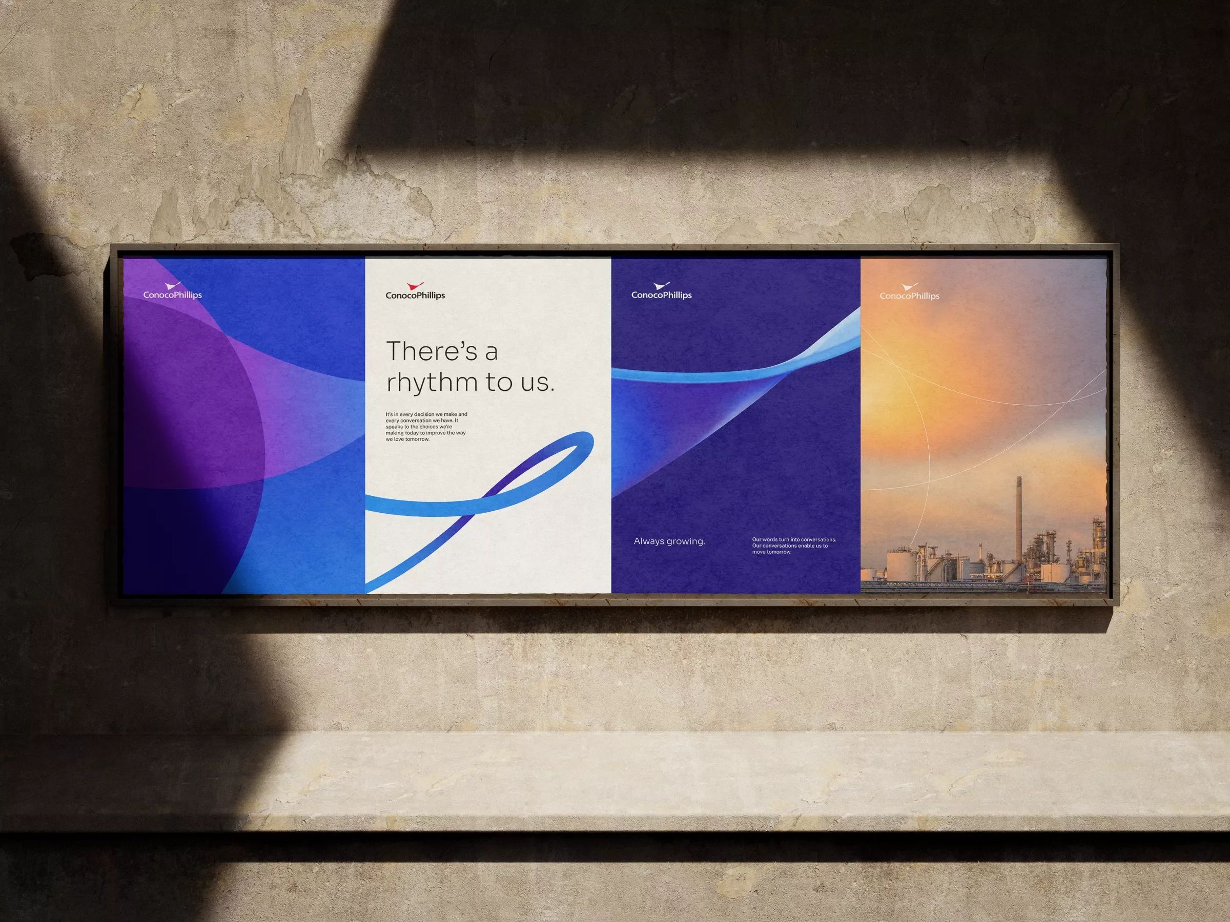
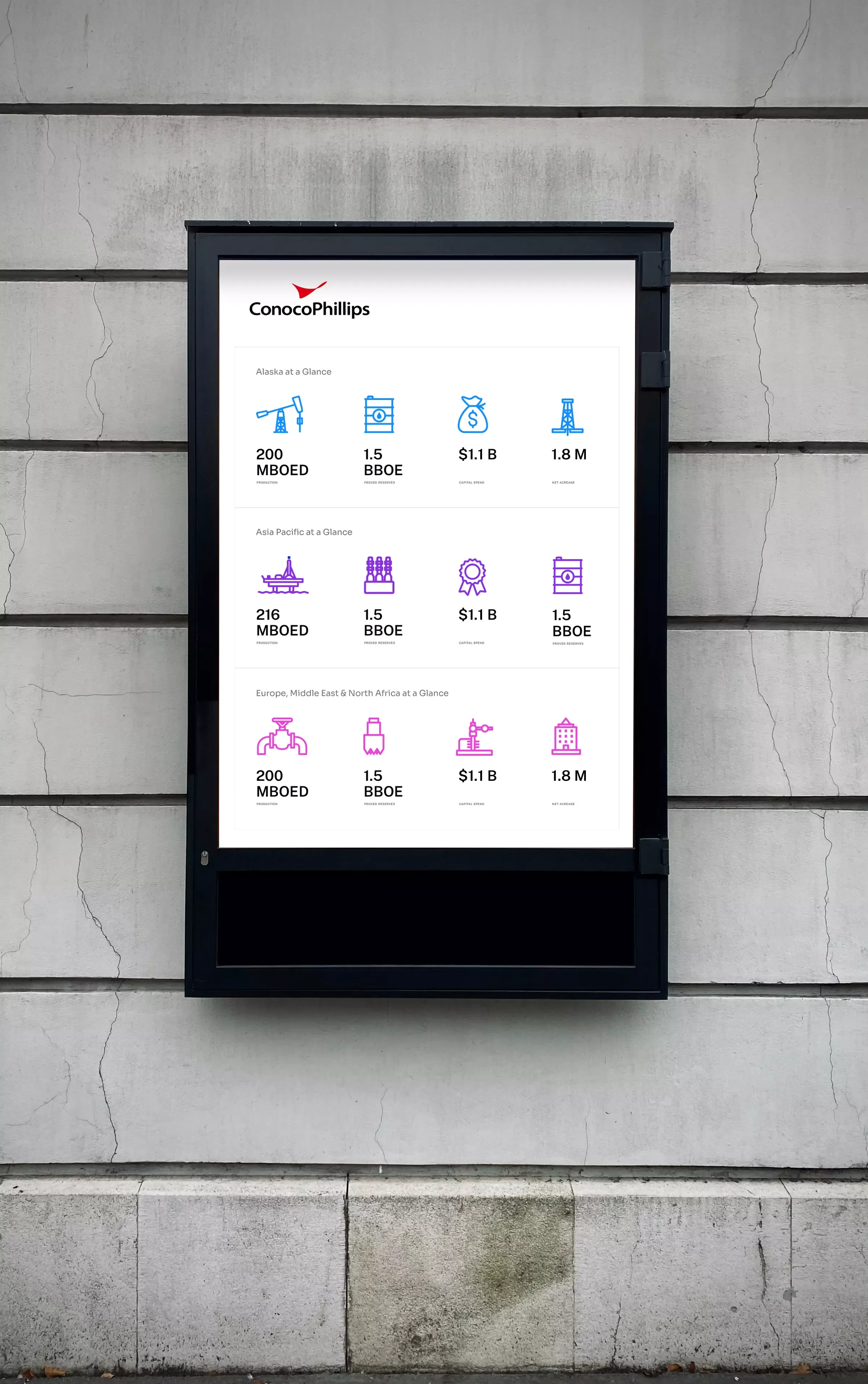
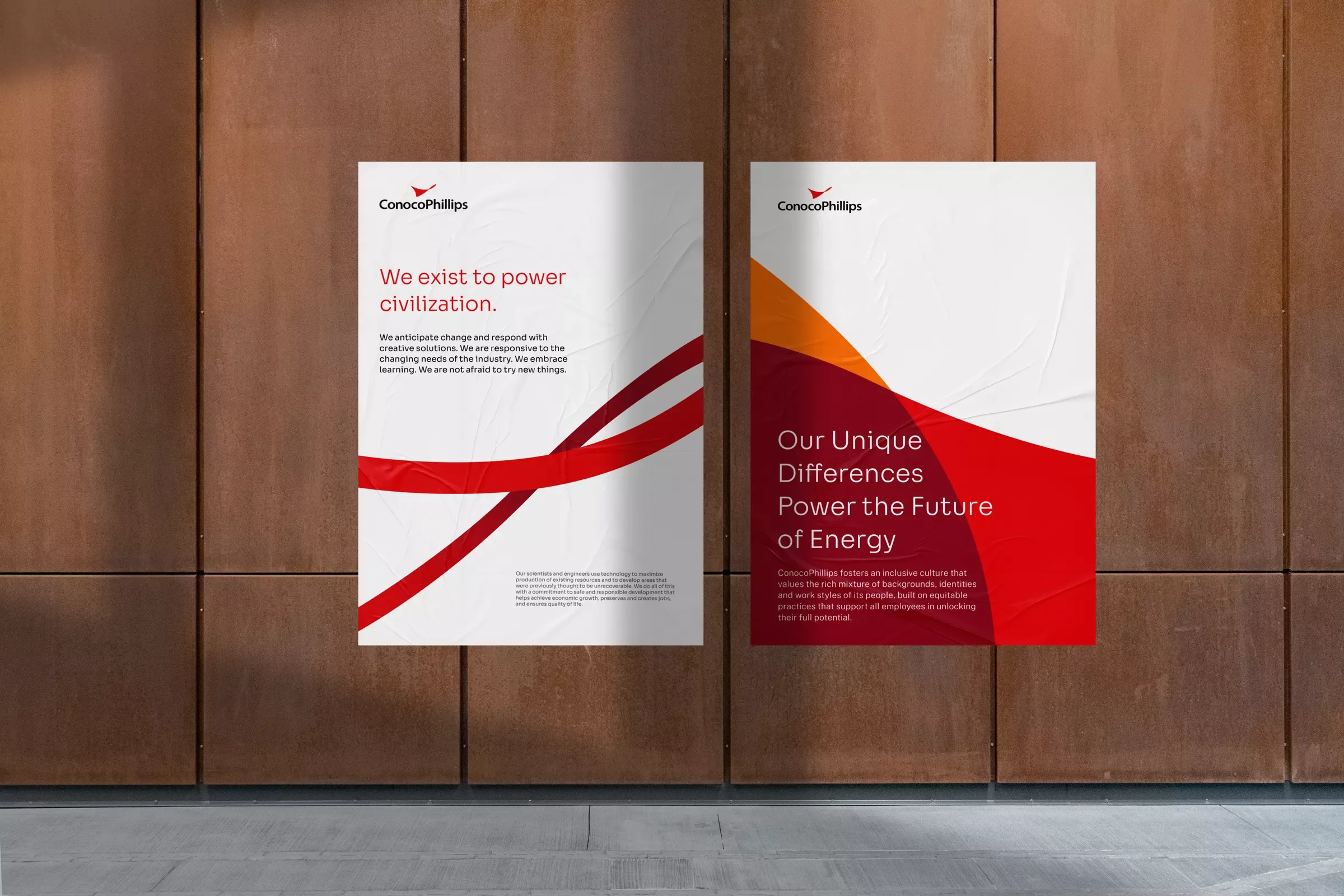
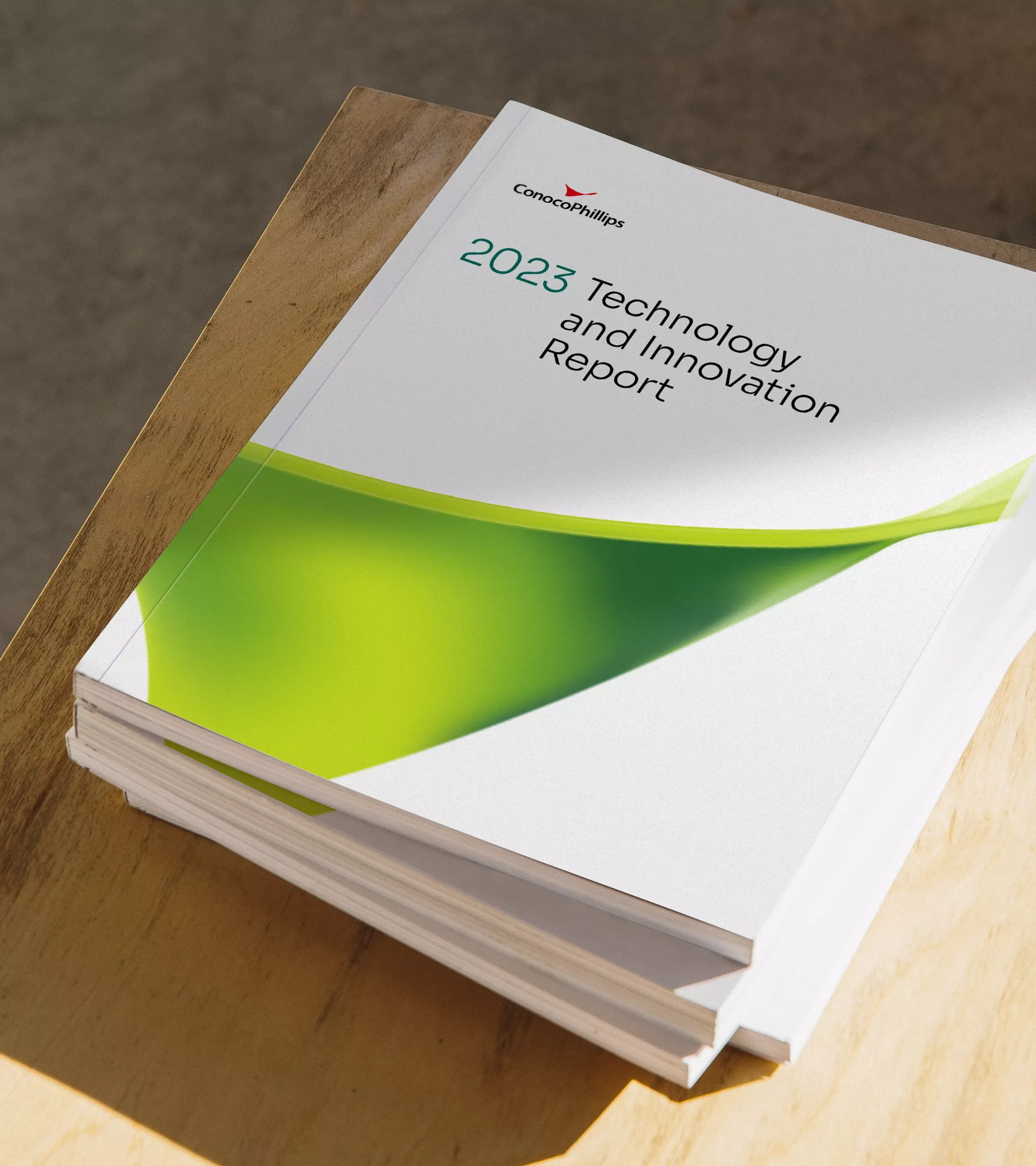
Through the metaphor of an orchestra - multiple parts in harmony - we unified the design system, updated the logo, enriched and expanded the palette, icons, and created a messaging hierarchy that reflected the true company culture.